Try three simple alignments
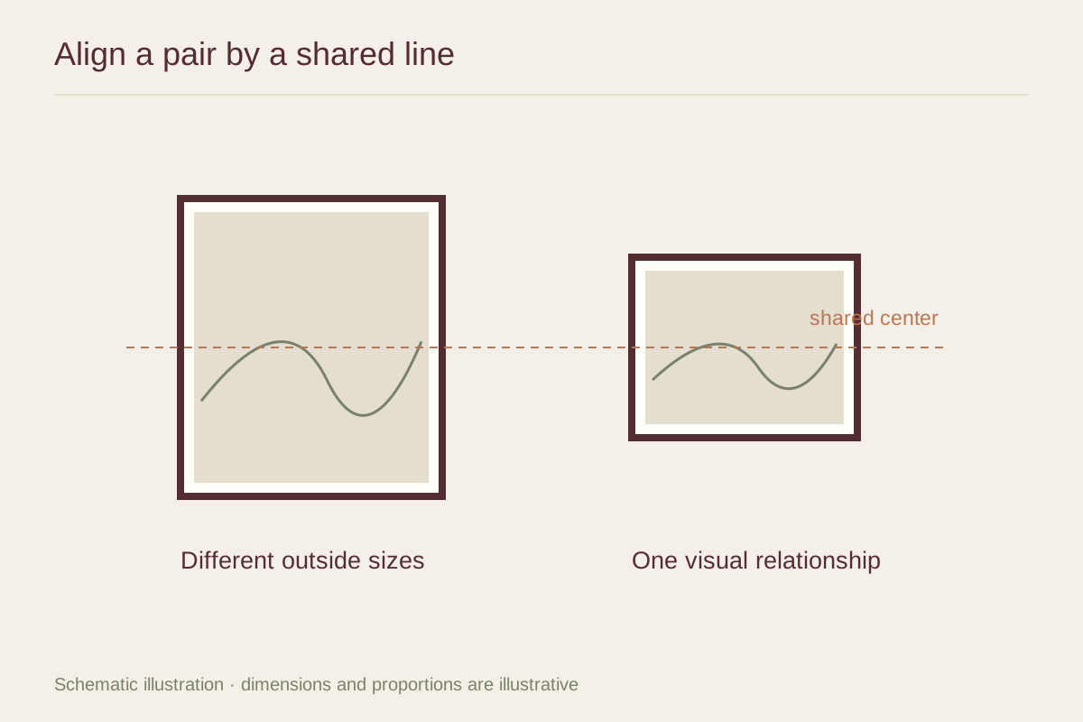
Lay the frames on a protected surface and compare aligned tops, aligned bottoms, and aligned centers. The best choice depends on their shapes and subjects. A tall portrait beside a short landscape may feel settled on a shared center line, while two works above a cabinet may benefit from a common lower edge.
Look at the image areas too. A broad mat can place the visible picture much higher or lower within the outer frame. If the outer edges look orderly but the images feel disconnected, adjust the mat or choose an alignment based on the pictures' visual centers.
Balance presence rather than area
The smaller work may be the stronger one if it contains vivid color or deep blacks. Give that relationship room rather than automatically placing the larger work in the dominant position. Switch their left-to-right order and see how the composition changes.
A shared frame color, similar paper tone, or repeated line can connect different subjects. You do not need all three. Too many matching details can make the unequal sizes seem like an error in an otherwise identical set.
Set the pair into its surroundings
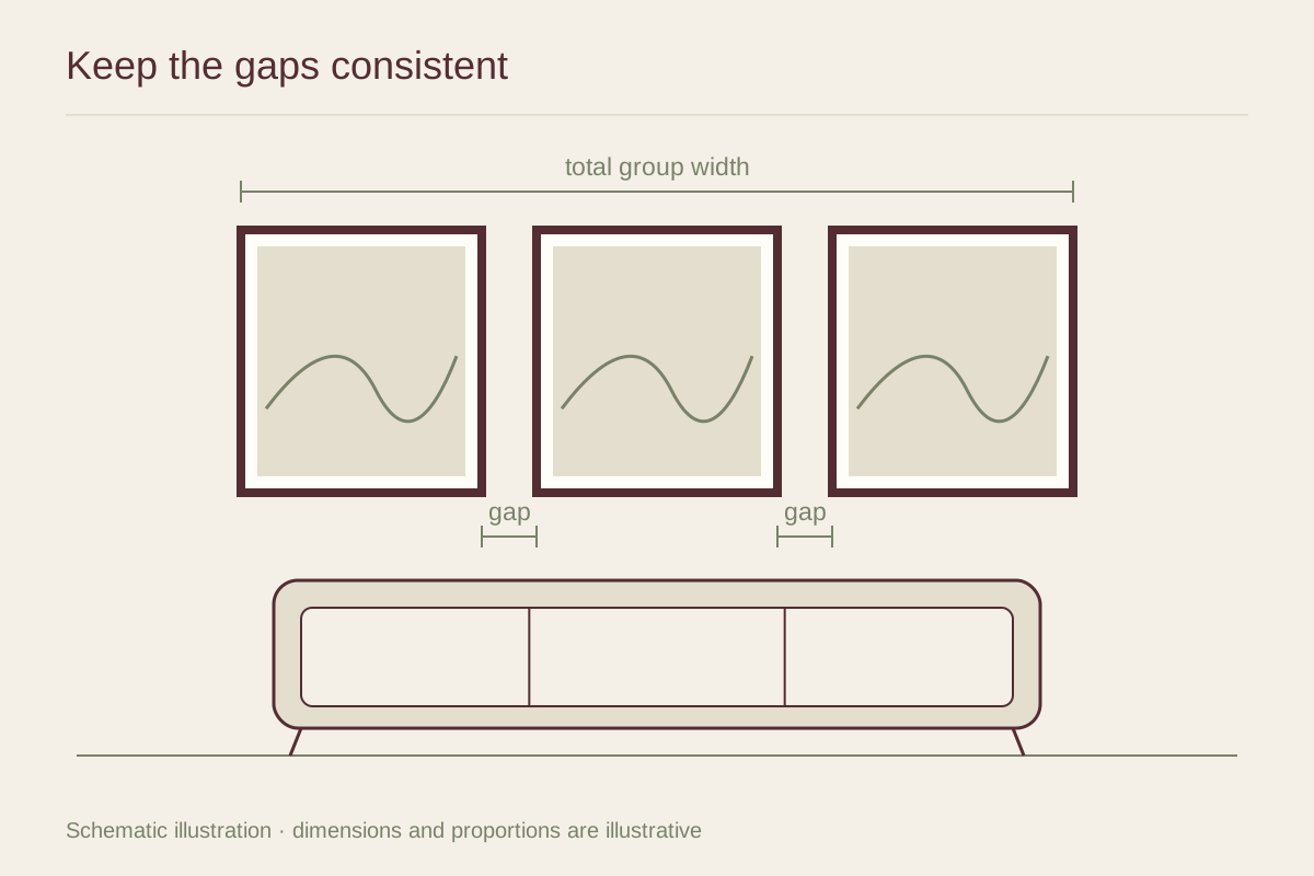
Measure the combined width and test paper templates above the furniture or within the chosen wall area. Use a gap that makes the works feel related without crowding their frames. There is no fixed gap that works for every profile and scale.
View the pair from the route into the room. If one work contains a face or strong directional line, its position may draw attention toward or away from its partner. Use that movement deliberately. The pair is complete when the two pictures feel like a considered conversation, even though their edges do not all agree.