Choose the size of the color event
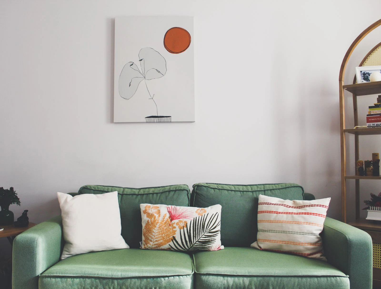
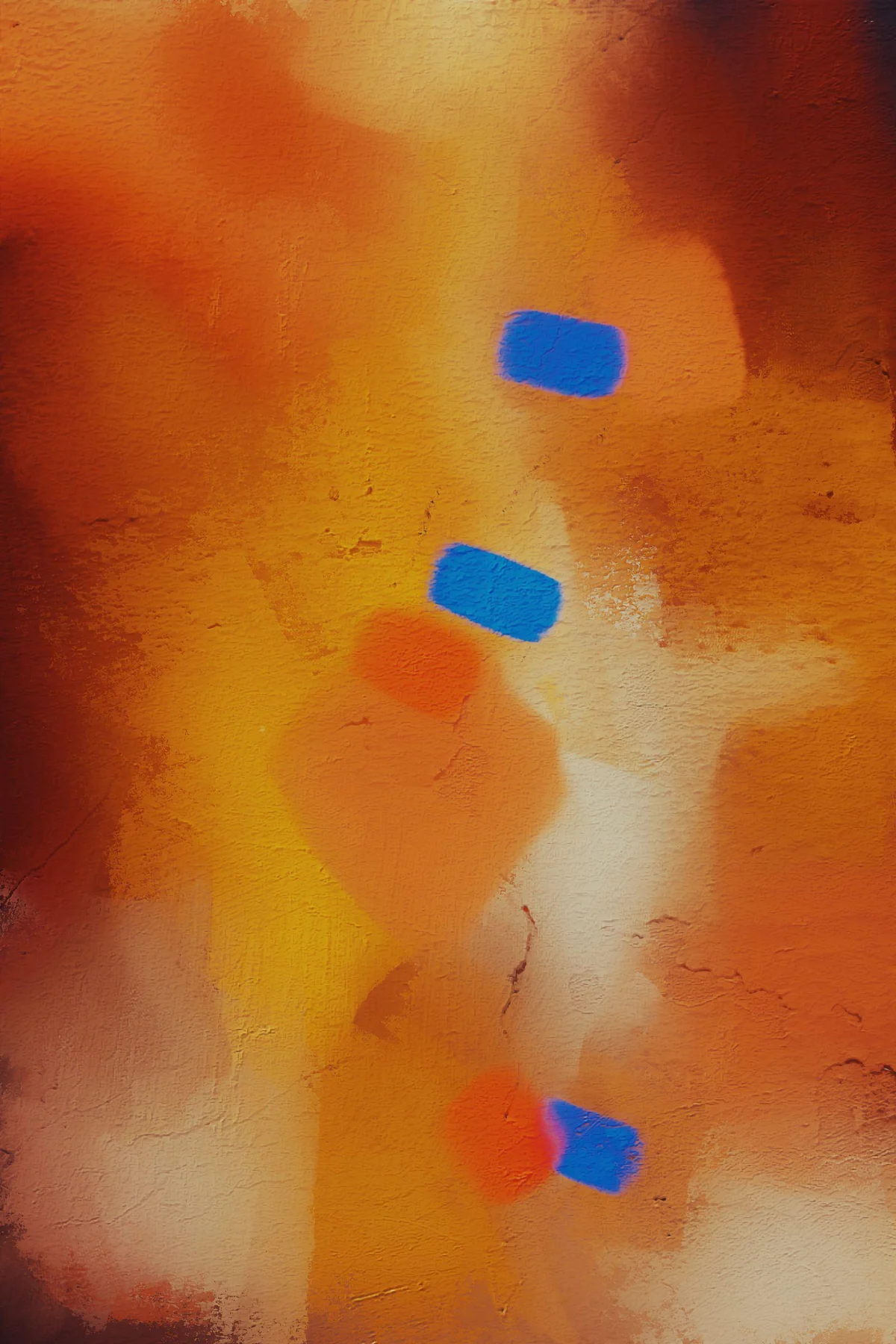
Look at the proportion of bright color inside the image. A small orange shape in a mostly pale print may feel like a lively detail. A full orange background becomes a major surface in the room. Compare both at the intended framed size, not just as equal thumbnails on a screen.
Consider the contrast around the color. A bright note surrounded by gray or black can feel more intense than the same note among several strong colors. The rest of the picture determines how much attention the accent receives.
Let repetition be optional
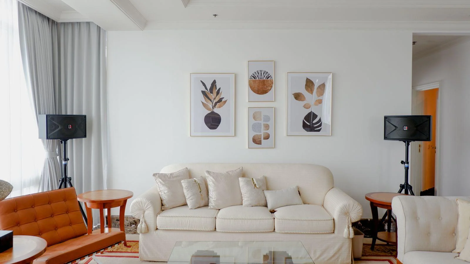
You can echo the accent in a cushion, book, or small object, but you do not have to buy a set of matching accessories. A single unexpected color can be a complete choice. If you repeat it, vary the amount and material so the room does not read as a coordinated display.
Use a frame that helps the image remain clear. A simple wood or dark frame may be enough. A brightly colored frame can amplify the accent, but it may also pull attention toward the border rather than the artwork's composition.
Judge it in daily light
A saturated color can look different under evening lamps than in daylight. Ask for a printed sample if an exact hue matters, and compare it with the room's large neutral surfaces. A warm white wall, gray sofa, and beige rug each influence the apparent color.
Leave a mockup in place long enough to notice your response on ordinary days. If the accent feels tiring, try a smaller image or one with less saturated area before abandoning the color. The right amount can give a quiet room energy while leaving its overall character intact.