Compare real whites
Bring a paint sample, a mat sample, and any available paper sample together in the room. Place them vertically where the artwork will hang. A sample lying on a table receives different light and can give a misleading impression of the final pairing.
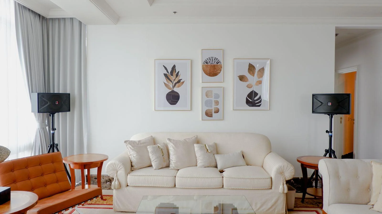
A bright white mat creates a crisp break from a creamy wall. An ivory mat creates a softer transition. Either can be deliberate, but two almost matching whites sometimes look less resolved than a clear difference. Look at the combination in daylight and under the lamps used in the evening.
Choose how much contrast you want
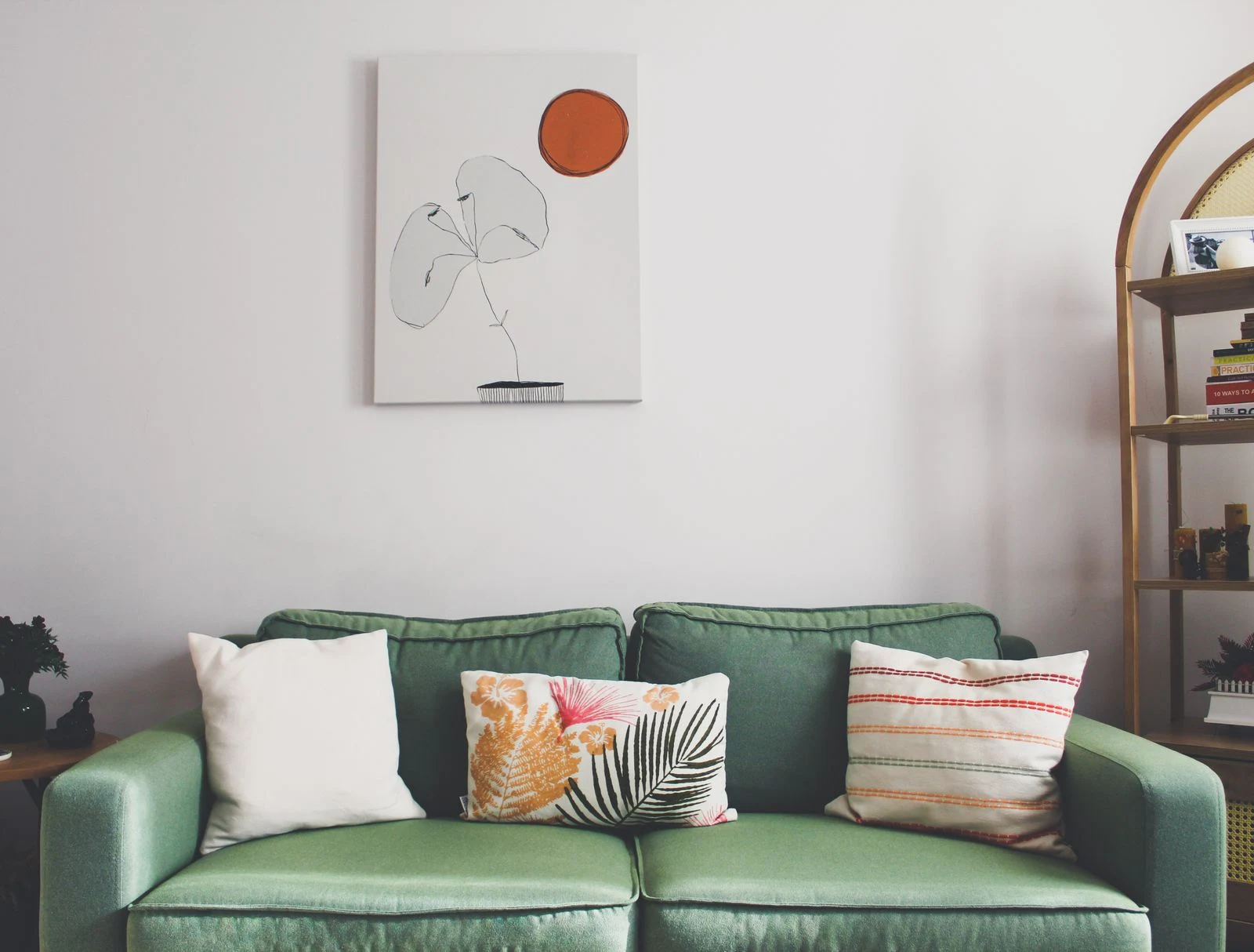
Soft earth colors, pale gray washes, and muted greens can sit quietly against warm white. Ink drawings and dark photographs create a more pronounced focal point. Before buying, decide whether the art should support an already busy room or provide the strongest visual event in a spare one.
Avoid requiring every color in the picture to match the room. One related note can be enough: a sandy background beside linen curtains, for instance, or a brown line that connects with a wood table. A cooler blue can also be welcome when the room already contains many warm surfaces.
Use the frame as a boundary
A dark frame can give a pale print enough definition to stand apart from the wall. Pale wood can keep the edge gentle, while a painted frame can repeat a small color elsewhere. Judge the frame with the actual image; a sample that looks appealing alone may pull attention away from delicate marks.
If you are unsure, narrow the choice to two complete combinations rather than collecting dozens of isolated swatches. Put a small reproduction inside each sample arrangement and step back. The useful question is whether the image remains clear and enjoyable in the room's changing light.
When the whites refuse to agree
Suppose a print has a visibly blue-white paper base and the wall is creamy. Placing a third, slightly different white mat between them can make the mismatch more noticeable. Try a mat closer to the paper, a clearly warmer mat, and a version with no visible mat, using appropriate spacers if the framing method requires them.
Choose the option in which the image looks clearest. You are not trying to make all three whites identical. A distinct boundary can look deliberate, while several almost matches may continue to bother you even after the frame is hung.