Decide what the sky contributes
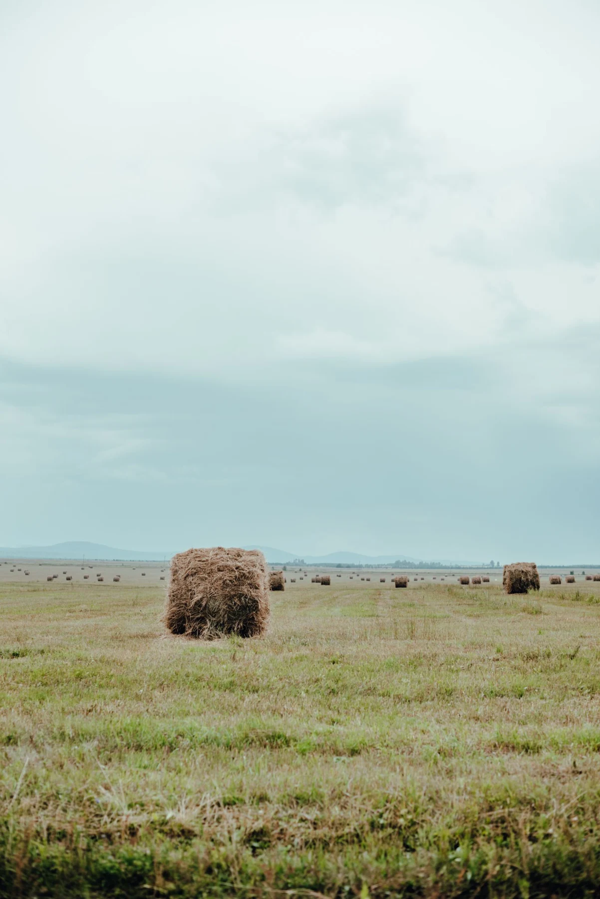
A nearly empty sky creates a broad field of color. A sky filled with layered clouds can be the most active part of the picture. Both may have a low horizon, yet they bring very different energy to a room. Choose between openness and movement before narrowing the palette.
The small band of land still matters. A dark coastline can give the print a firm base; pale distant hills may make it feel more suspended. Check whether the land remains distinguishable at the print size you plan to buy. If it becomes an indistinct strip, the image may lose the balance you noticed on screen.
Relate the horizon to nearby furniture
A low horizontal landscape above a cabinet can repeat the cabinet's long line without depicting the same proportions. Leave enough wall between the two so the print is not visually resting on the furniture. Use the full outside frame size in your placement test.
Avoid choosing hanging height solely to align the painted horizon with a shelf or window edge. The artwork needs to sit comfortably as an object, and the horizon belongs to its internal composition. A forced alignment can leave the frame itself too high or too low for the room.
Frame the open space gently
A broad pale mat can extend the sense of air around a soft sky, while a dark frame can define its boundary more firmly. Compare both with a sample; a very pale image may need a clearer edge on a light wall. If the sky already occupies most of the sheet, an oversized mat can sometimes make the land feel unnecessarily remote.
For a bedroom, a quiet blue-gray sky may work with layered neutral textiles. For a dining space, a more dramatic cloud formation can provide movement above simple furniture. The same horizon position supports both choices. Let the image's actual light, contrast, and detail guide the room relationship rather than assuming every sky-heavy picture will feel calm.