Judge the line from across the room
A fine pale contour may look beautiful on a product page yet vanish above a textured sofa. Check the thickness and contrast of the actual line at the intended print size. A bolder mark or a larger image may be more effective than adding an elaborate frame around something too faint to see.
Use a printed preview at approximate scale if available. Stand at the doorway and identify what remains visible: the whole gesture, a small dark knot, or almost nothing. The line should still describe an intentional shape from the room's ordinary viewing distance.
Give the mark a quiet surround
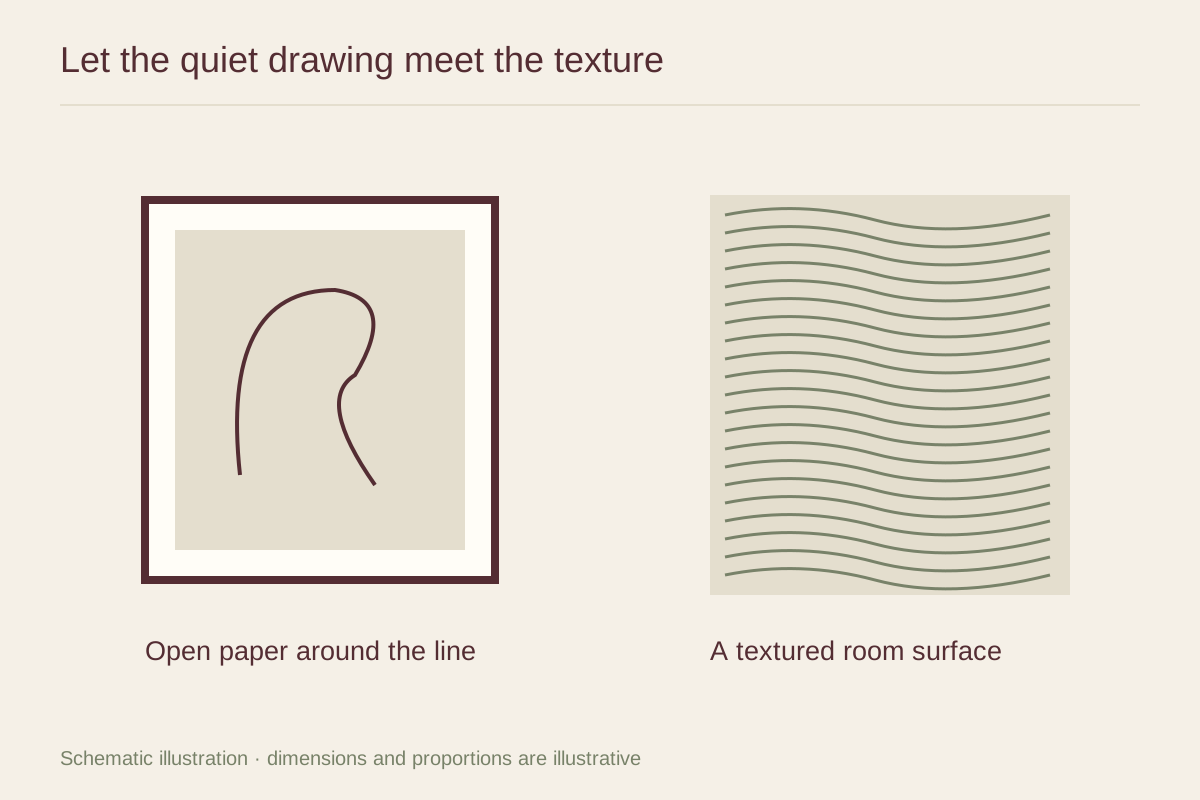
A plain mat and restrained frame can separate the image from a busy wall finish or nearby textile. A heavily grained molding may introduce another pattern that the line does not need. Try a smooth painted frame or a subdued wood tone that connects with one material already in the room.
Open paper is part of the composition. Do not crop it away automatically to enlarge the line. A drawing with generous space can feel balanced precisely because the gesture occupies only a portion of the sheet. If the complete print is too small, choose a larger edition rather than changing that relationship without considering it.
Create a deliberate contrast of surfaces
In a room with a nubby cream sofa and an irregular timber table, a black contour on a smooth warm-white ground can offer a crisp pause. In a darker room, a pale line against a deep background might be more readable. Neither arrangement requires repeating the line motif on cushions or other objects.
Keep nearby accessories relatively simple while testing the picture. A row of sculptural vases may compete with the same curves the drawing uses. Remove one element at a time and see whether the artwork becomes easier to read. The successful pairing lets physical texture and drawn line remain distinct experiences within the same room.