Choose the transition at the frame
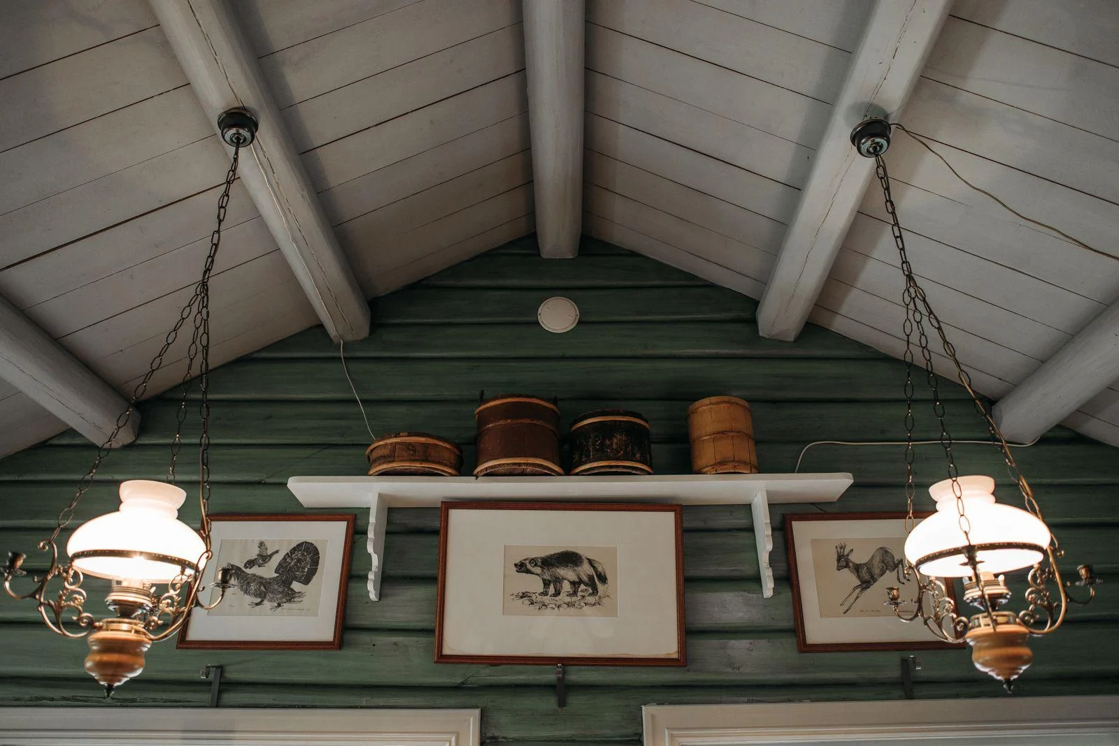
A light mat creates a clear pause between a dark wall and the image. It can help delicate lines remain readable, though a broad bright border may become the most conspicuous part of the display. Try an off-white or soft gray sample if a stark white feels too abrupt.
A dark frame without a pale mat can blend into the wall and emphasize the image. Check it in evening light, when the edge may nearly disappear. If you want a little separation, a wood tone, a narrow metallic finish, or a slightly lighter painted frame may provide enough distinction.
Inspect the picture's dark areas
A moody photograph can look rich on a dark wall, but important detail may be hard to see in a dim room. Ask for a close-up or view a sample in person when possible. Brightening a screen preview does not tell you what the printed shadows will look like under your lamps.
Conversely, a pale image may become more forceful than expected. Place a full-size paper outline on the wall and add a representative image sample. The combination of light paper and a dark surround can give even a modest print substantial presence.
Check glare before choosing the spot
Stand in the main viewing positions and notice reflected windows and lamps. A reflection across dark areas can hide much of the image. Changing the wall location or lamp position may help more than simply choosing a brighter picture.
If you consider specialist glazing, compare the actual products and their care instructions with your framer. Anti-reflective appearance and UV filtering are different properties. Keep paper art away from direct sun even when glazing filters ultraviolet light, and choose the work for how it looks in the room's normal conditions.