Notice which pattern leads
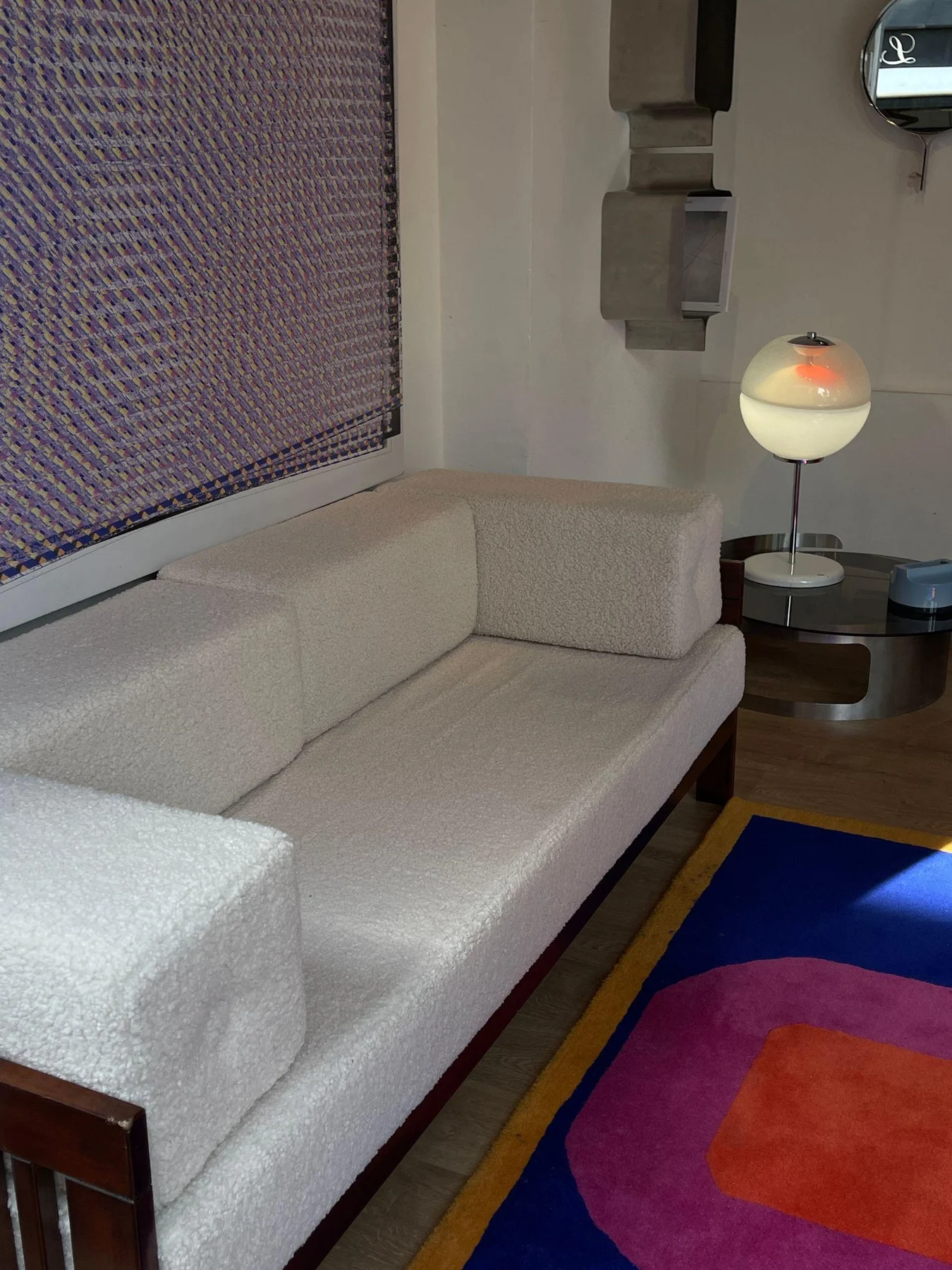
Look at the rug from a few steps away. Some patterns merge into a nearly solid field at room distance; others retain sharp borders and large motifs. A quiet, faded rug can support detailed artwork more easily than a high-contrast geometric rug that remains assertive across the room.
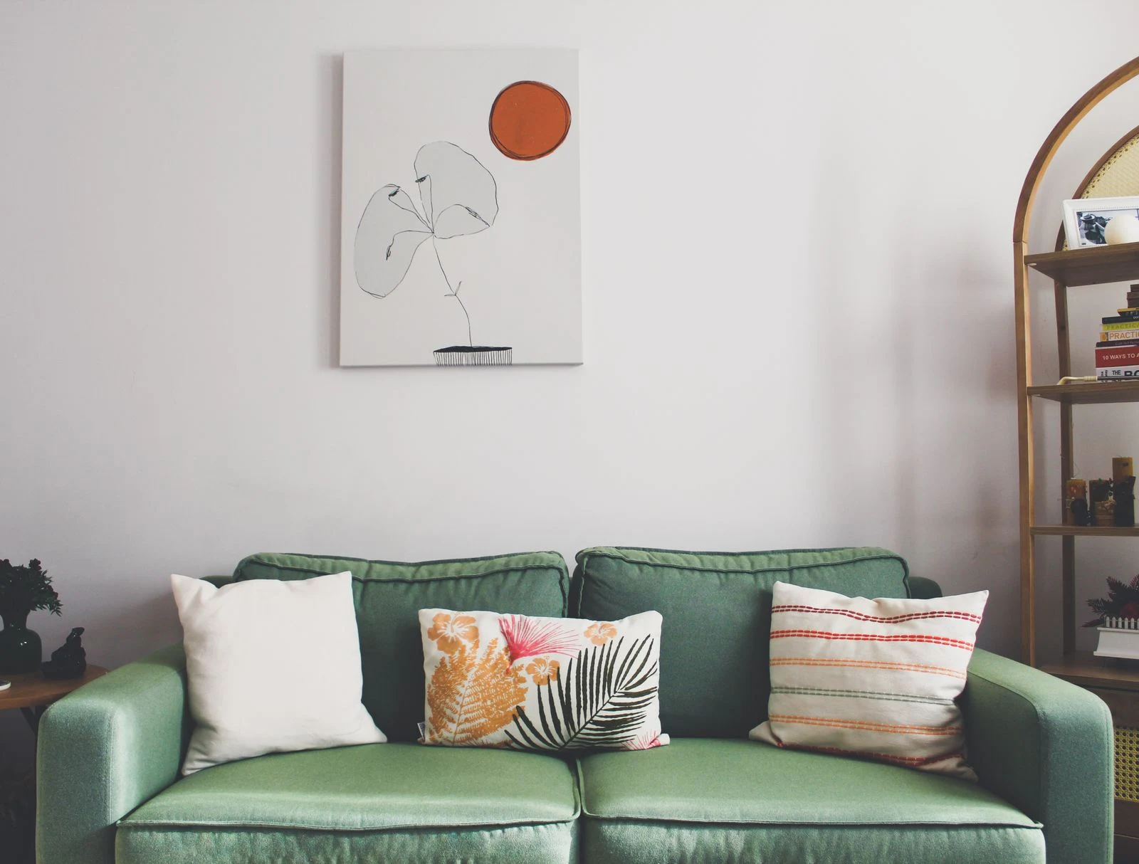
Do the same test with the proposed picture. Small brush marks may merge into one broad shape, while a single black line can remain strong. Counting the number of colors will not tell you how busy an image feels. The size and contrast of its marks matter as well.
Connect one quality
Choose a connection that is easy to explain to yourself. It could be a muted red found in both pieces, a shared curved shape, or the same sense of open space. The connection need not be exact. A rust accent in the rug and a dusty peach in the print can feel related without appearing to come from a matching set.
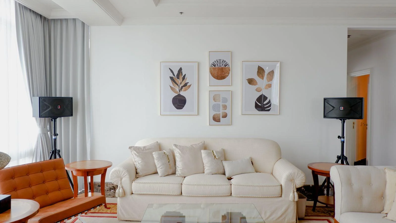
For a rug with many small repeated motifs, try an artwork with larger, less frequent shapes. For a rug with broad stripes, a drawing with irregular organic lines may provide useful variety. You are changing the pace rather than finding another surface with the same design.
Give the wall some quiet
A mat can provide breathing room between detailed art and the rest of the room. That does not require an oversized border; even a modest area of plain paper can make the image easier to read. Keep nearby accessories restrained while you judge the combination.
View a mockup with the rug fully visible, not just a cropped photograph of the wall. If your eye keeps moving between competing patterns, remove one variable: a smaller art grouping, a simpler frame, or a less detailed picture. There is no need to replace a rug you enjoy simply to accommodate one print.
Use a small comparison to resolve a busy room
Imagine a rug with tiny blue and rust motifs. Compare a detailed botanical print that repeats both colors with a landscape containing one broad blue-gray sky. The botanical may reinforce the room's richness; the landscape may give the eye a slower interval. Neither choice follows from the colors alone.
Make the comparison with the same frame size and roughly the same placement. If one version uses a much larger frame or broader mat, you may be responding to scale rather than the image. Keeping those variables steady makes your preference easier to understand and use.