Translate the sales language into specifications
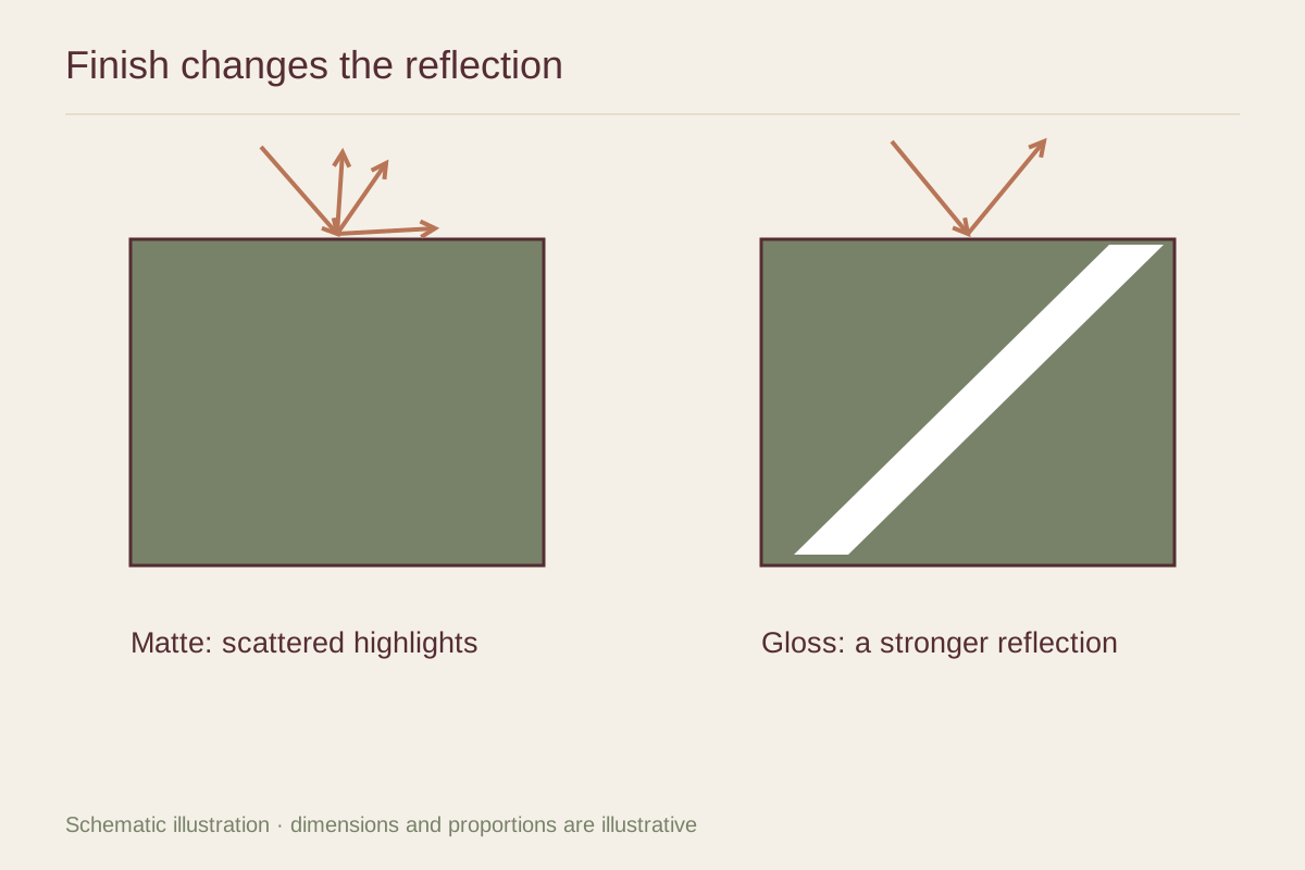
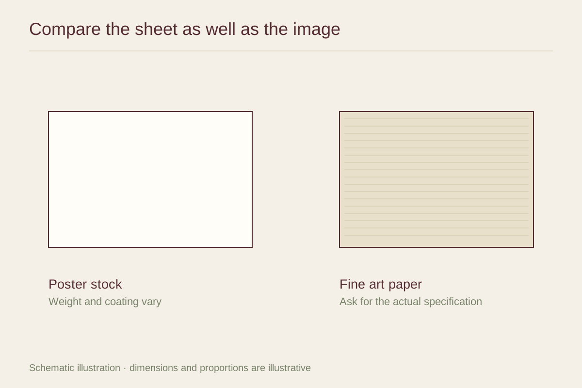
A poster is a type of printed object, not a single paper recipe. It might be produced on a light coated sheet, a substantial matte stock, or a paper also sold for photographic printing. Fine art inkjet papers likewise include smooth, textured, matte, and glossy surfaces. Hahnemühle, for example, groups its FineArt collection into several surface families. The category name does not tell you which appearance you will receive.
Look for the paper manufacturer and product name, surface finish, weight in grams per square meter, and fiber description. A heavier sheet generally feels more substantial in the hand, but weight does not measure image sharpness or guarantee resistance to fading. A thin sheet can carry a clean, detailed image; a thick sheet can still be poorly printed.
Decide whether the paper should be visible
For a borderless graphic poster behind a mat, much of the paper's tactile character may disappear in the final presentation. Accurate color, clean type, and a suitable finish may matter more than an especially luxurious sheet. A print displayed with its whole border visible gives the paper a larger role. Its white tone, texture, and edge become part of the composition.
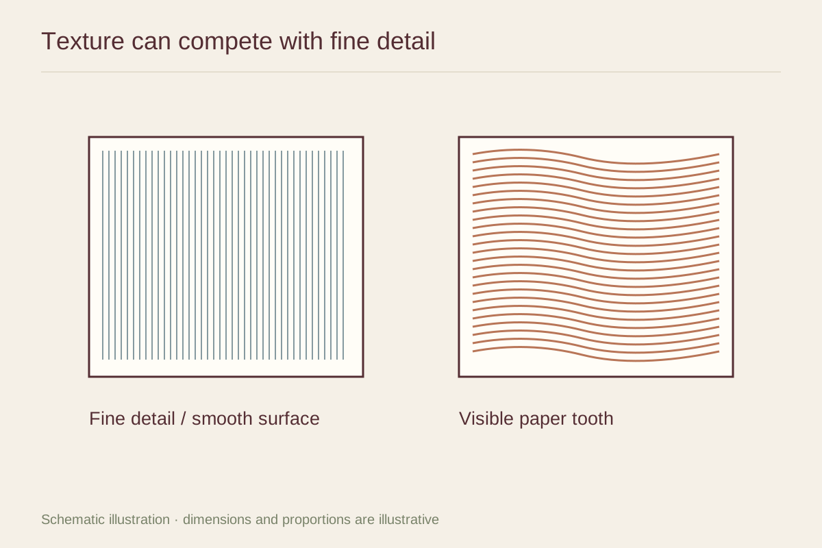
Imagine a pale pencil drawing on a softly textured cream sheet, then imagine the same drawing on a bright, smooth sheet. The first may make the drawing feel integrated with the surface; the second may emphasize the marks more distinctly. Neither effect is automatically better. Compare a sample against the particular image instead of choosing paper as a status category.
Evaluate the complete print
Ask about the printing process and ink as well as the paper. Longevity belongs to a combination of materials and display conditions, not to the word archival on its own. If a seller provides a permanence claim, look for the tested combination and conditions rather than assuming every print on that paper has the same expected life.
A small proof is especially useful when the image contains subtle grays, deep shadows, or nearly white areas. View it in the room where the finished print will hang. Check whether the paper tone works with the wall and mat, and whether fine details remain legible at your usual viewing distance.
Compare the finished cost
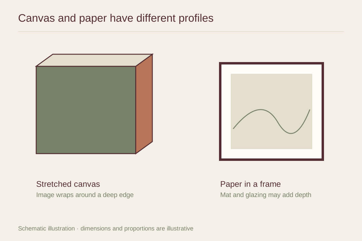
Include framing in the comparison. A moderately priced poster in an appropriate frame may suit a frequently changed dining display. A carefully produced print on a distinctive paper may deserve a presentation that lets its border remain visible. Before paying more for either option, identify the feature you will actually see: texture, color, scale, or the way the image sits within its frame.