Look at dark areas and empty areas
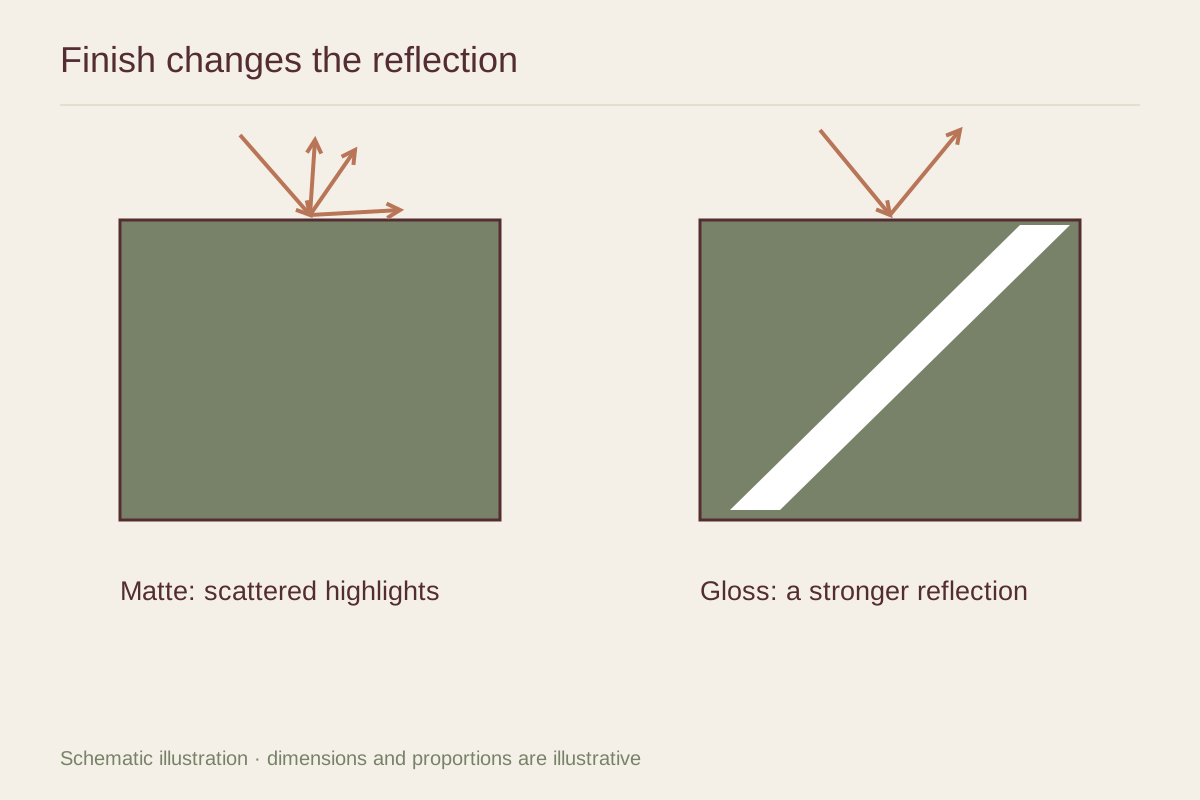
Take two samples of the same image if possible. In a glossy finish, dark tones may appear deeper and color separation more pronounced when reflections are absent. A matte surface scatters light differently and often looks softer. Those are tendencies, not guarantees: the paper coating, ink, and printing process all affect the result.
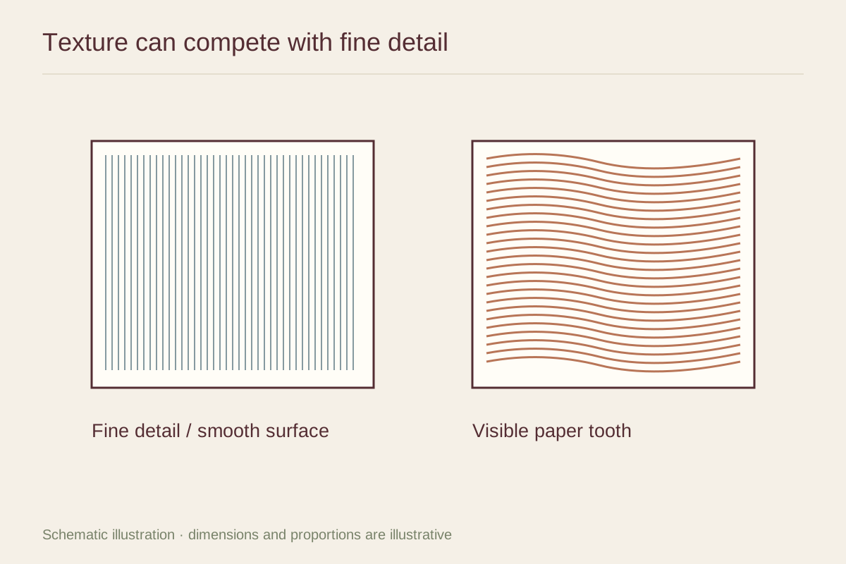
Evaluate the quiet parts of the photograph as carefully as its strongest colors. A smooth gray sky can reveal a finish more clearly than a busy forest. Ask whether the surface supports that sky or becomes another texture competing with it. For a graphic illustration with flat color, also examine large uninterrupted shapes.
Test the real viewing angles
Hold a sample upright where the picture will hang and look from the doorway, your chair, and the side of the room. The brightest reflection may appear from only one of those positions. An image that looks clear at a shop counter can behave differently on a wall opposite a large window.
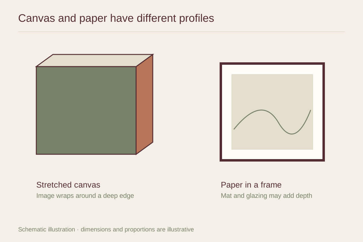
Remember that glazing adds another surface. Matte paper behind ordinary glass can still reflect the room. If the print will be framed, compare the full arrangement of print, glazing, and light. A change of wall position can be more effective than repeatedly changing paper finishes.
Consider the middle finishes
Luster, pearl, satin, and semigloss are useful descriptions, but they are not interchangeable across every supplier. Some have a fine stippled surface; others are smoother. Request a physical sample or a close photograph taken at an angle, and use the seller's exact product name when ordering again.
For an intimate portrait on a side table, a restrained sheen might keep the face clear without emphasizing every reflection. A bold architectural photograph viewed from across the room may benefit from a different treatment. Choose with the intended presentation in mind, then keep the paper and finish details with your order so a later companion print can be compared accurately.