Look at the amount of color
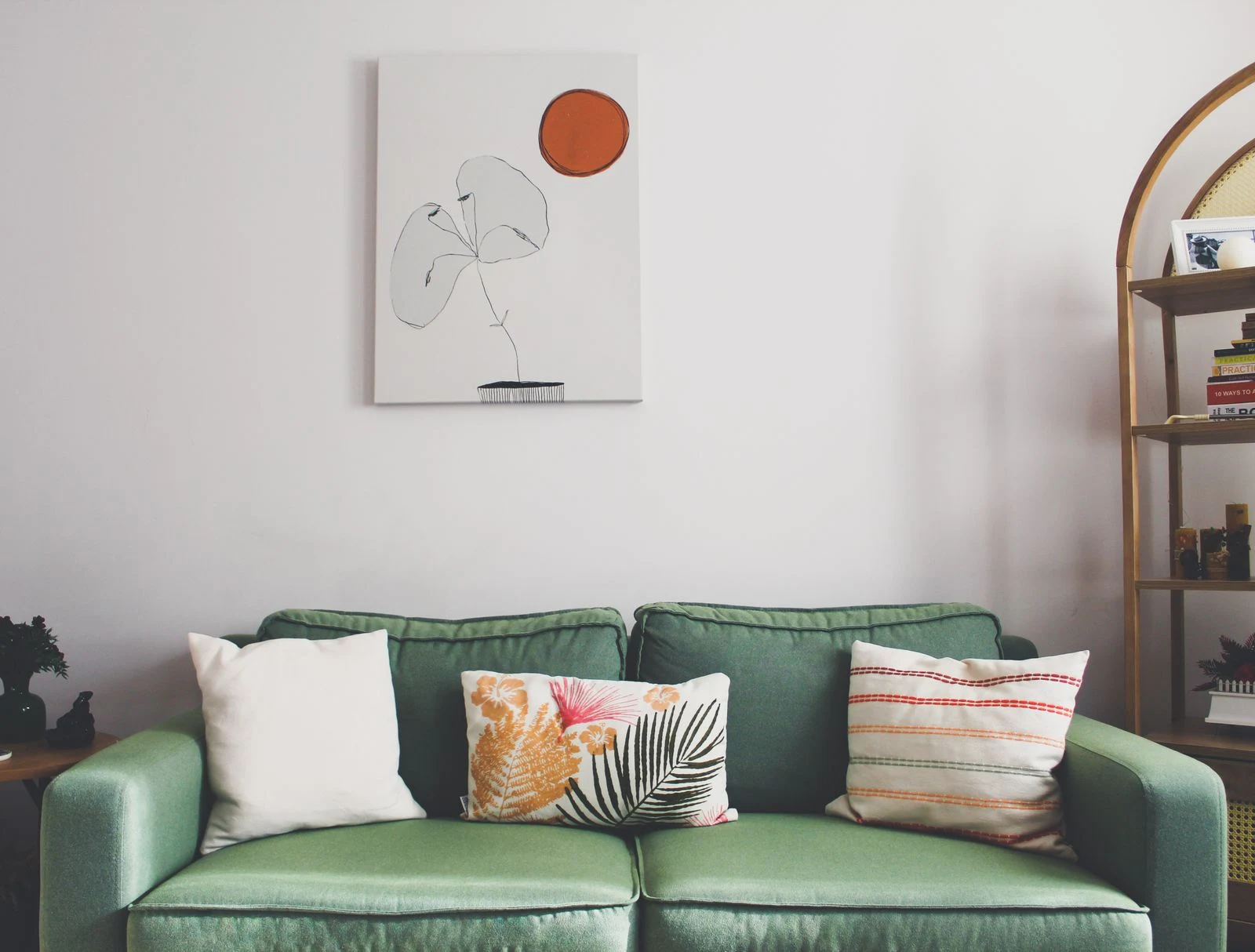
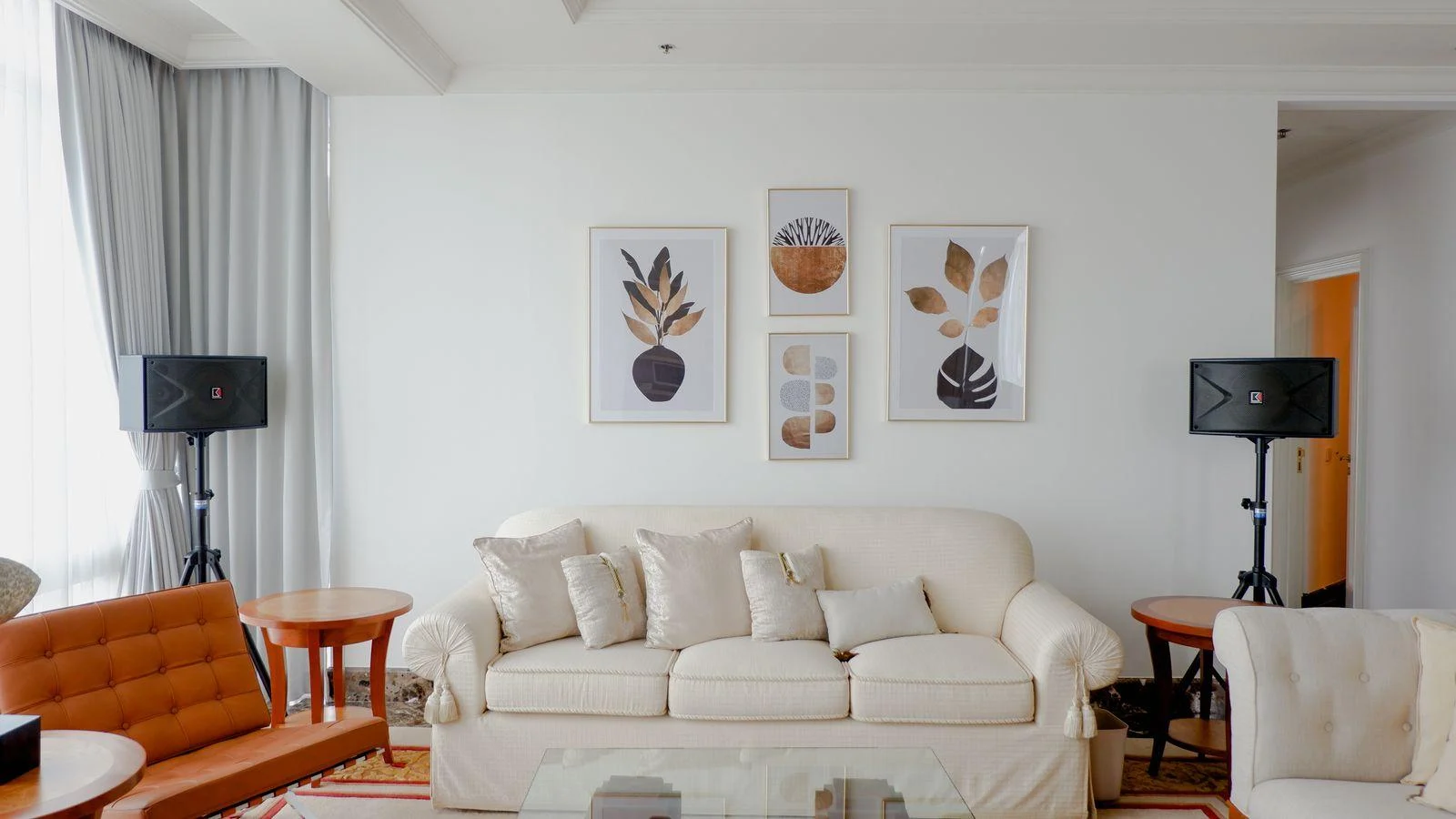
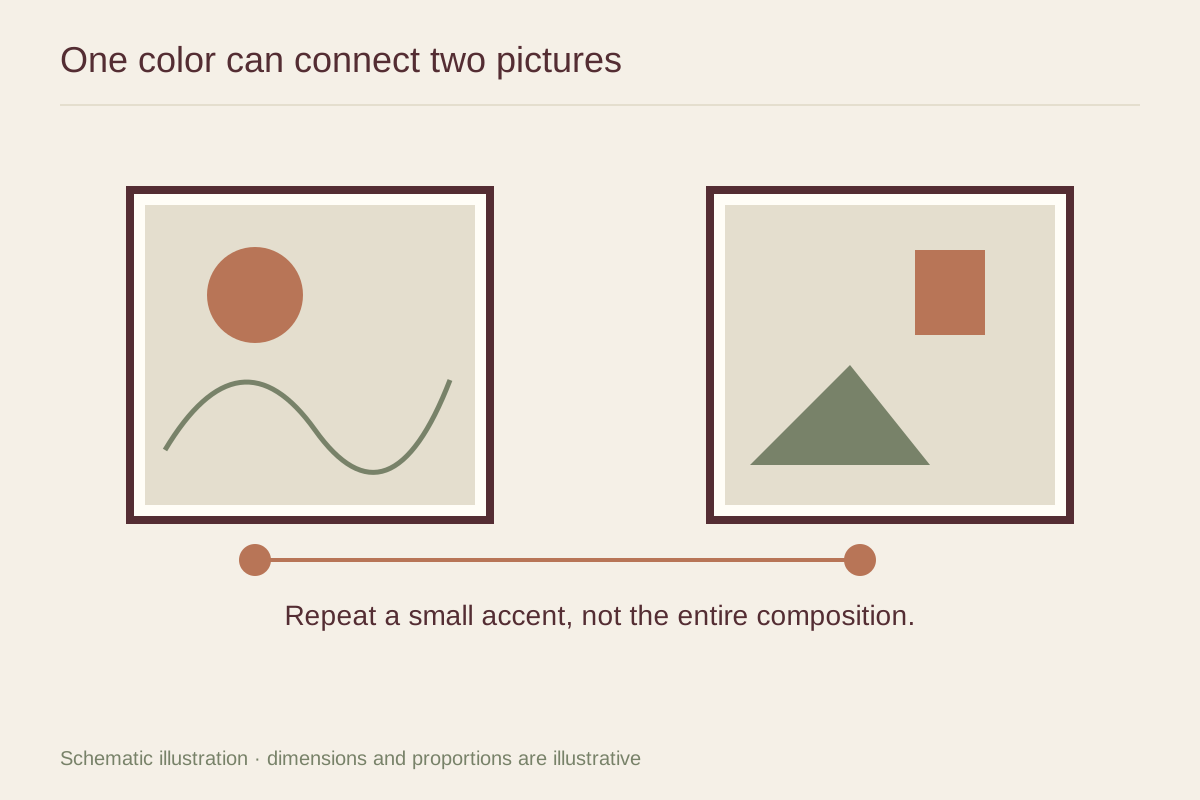
A red dot in one picture and a broad red field in another create a different relationship from two equally red pictures. The first pair has a clear lead and supporting note; the second may feel more evenly matched. Neither is inherently better, but the choice affects where the eye settles.
Set the images side by side at a similar display scale. A phone collage is helpful for arrangement, though actual samples remain better for color. If a shared color is so small that it disappears from normal viewing distance, it may not provide the connection you expected.
Compare warmth and intensity
Colors do not need to match exactly. A rusty orange and a muted terracotta may create a gentle link, while an orange-red and a cool pink can feel more varied. Pay attention to saturation as well as hue. A bright clear color beside a dusty version can make one image feel much louder.
Look at the backgrounds too. Cream paper, gray washes, or white negative space may connect the works more strongly than their accent colors. A pair that seems unrelated in small cropped previews can become coherent once the whole sheets and borders are visible.
Give the connection room
Try the pair with simple frames first. If the artwork already shares a useful color, the frames do not need to repeat it. Matching frame profiles can make different subjects feel like a pair, while different profiles can keep the arrangement less formal.
Check the pair in its intended room rather than in isolation. A sofa or curtain in the shared color may reinforce the connection, but repeating the same accent in many nearby objects can make the arrangement feel overplanned. Let the two images retain their own character, and use the color as a quiet point of agreement.
Try a bridge outside the pictures
Sometimes two works you enjoy share no obvious color, yet both suit the room. Before rejecting the pair, test a common mat tone or related frame finish. Those surrounding materials can provide the connection while the images remain distinct.
For example, a cool coastal photograph and a warm figure drawing may sit well in slim dark frames with similar pale margins. That framing relationship is visible from across the room and does not require altering the images or buying a third picture whose only job is to contain both palettes.