Read the grain from a distance
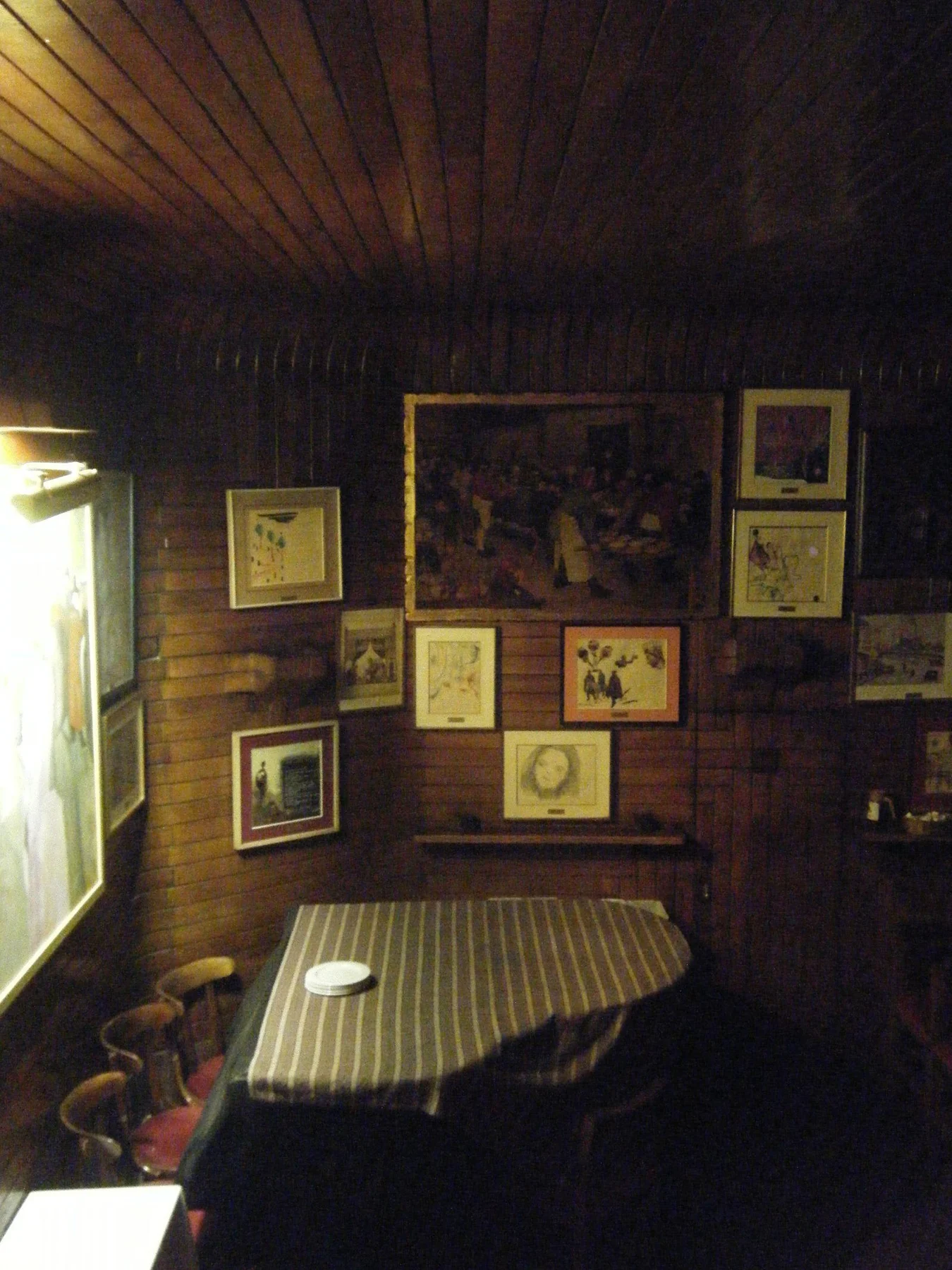
Stand where you normally enter or sit. Fine grain may merge into a nearly solid tone, while knotty boards and pronounced vertical seams remain active. A detailed drawing can be comfortable against quiet paneling; bold grain may benefit from a print with larger areas of open space.
Do not feel obliged to align every frame edge with a panel joint. A small adjustment can make a frame look settled, but forcing the layout to follow the boards may pull it away from the furniture it belongs with. Compare the two relationships before deciding.
Separate or repeat the wood tone
A wood frame close to the paneling can create a subtle layered effect. If the tones are nearly the same but slightly discordant, a dark painted frame may give a clearer boundary. A pale mat can also separate the image from the wood without requiring an entirely different frame material.
For warm honey-colored panels, try the actual print beside them rather than assuming every cool color will clash. Blue, green, and black-and-white images can provide useful contrast. Choose a connection with the room as a whole, including the floor and upholstery, rather than matching the wall alone.
Account for the physical wall
Check how the paneling is built before choosing a mounting method. A decorative thin panel is not the same support as a substantial board or a stud behind it. The correct fixing depends on the frame weight and the wall assembly; follow the hardware instructions or have the structure assessed if it is unclear.
Use a template to test the final framed size, then inspect the view under evening light. Wood can feel much warmer under some lamps, and glare can change the balance of the image. A considered contrast usually feels more convincing than trying to hide the artwork within the paneling.