Gather the large surfaces first
Use samples of the wall paint, main upholstery, rug, and curtains where available. If a physical sample is impossible, use a photograph as a rough reminder and mark it as approximate. Screen images and printed photographs cannot reliably reproduce every material color.
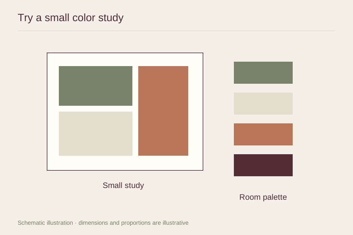
Arrange the samples in proportions that roughly reflect their presence. A large wall swatch and a tiny accent swatch tell a different story from equal squares of every color. You do not need mathematical accuracy; the aim is to avoid giving a small accessory the same importance as the sofa.
Add the artwork as a complete image
Include the whole picture rather than extracting only its most convenient color. The background, darkest area, and amount of open space all affect how it sits in the room. Add a frame and mat sample if those choices will be visually prominent.
Make two versions with one change between them. You might compare a warm mat with a cool white one, or a quiet print with a more saturated image. Changing one variable makes the result easier to understand than building entirely different boards each time.
Move from the study to the wall
View the samples vertically in the intended room under daylight and evening lamps. A tabletop arrangement near a window may look much brighter than the finished display. Record which combination works in the conditions you actually use.
Once a color relationship feels promising, test the artwork's full framed size with paper. A successful small study does not guarantee that a large field of color will feel balanced. Use the study to narrow choices, then let real scale, viewing distance, and your response to the image decide the final arrangement.