Find the illustration's background tone
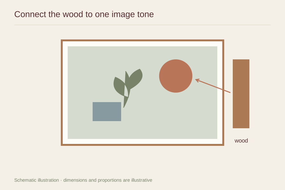
The largest pale area often matters more than the brightest small accent. An illustration on cream paper can sit naturally beside a muted warm wood. A design with a cool white background may make the same wood look conspicuously yellow. Place the frame sample directly beside the paper with the proposed mat between them.
If the image has no open background, identify its dominant color family. An earthy landscape illustration and a bright cyan graphic can ask different things of the same oak-colored frame. Compare the whole picture instead of matching a tiny leaf or roof tile.
Control the grain
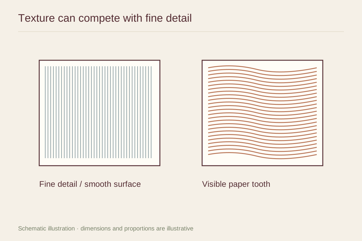
A pronounced wood grain is another pattern around the image. It can complement a loose, textured illustration, but compete with intricate linework. A quieter grain or painted wood finish may be preferable when the drawing already contains many small marks.
Look at a longer sample when possible. A small corner cannot always show how varied the grain will be across a complete frame. Ask whether the finished molding may differ in tone and figure. Natural variation can be attractive, provided you are choosing it knowingly.
Test a subdued option first
Begin with a restrained wood tone, then compare a darker or warmer one. This creates a clear baseline. If the more assertive frame makes the illustration's colors feel muddier or less distinct, return to the quieter option rather than adding more colors in a double mat to compensate.
A simple example is a blue and coral illustration in a room with walnut furniture. A medium brown frame may connect with the furniture, while a lighter neutral wood can keep the picture more airy. Both can work without copying the furniture exactly. Include the wall color and leave the samples in place long enough to see them under evening light before ordering.