Find one connection across the media
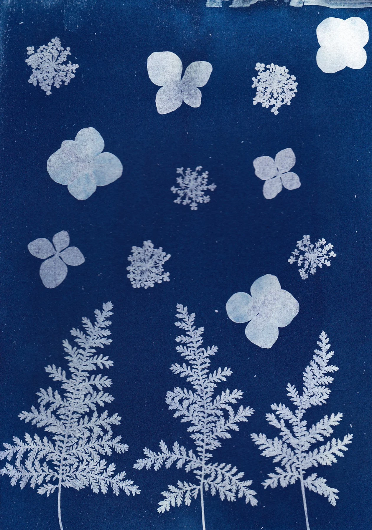
Start with a related subject, palette, or compositional line. A photograph of a curved stair can sit beside an abstract drawing with a similar sweep. A botanical photograph and a plant illustration can share a subject while showing two ways of looking at it.
Avoid using every possible connection at once. Matching subject, color, size, and frame exactly can make the pairing feel overly literal. One or two shared qualities usually leave more room for each image to contribute something distinct.
Balance detail and empty space
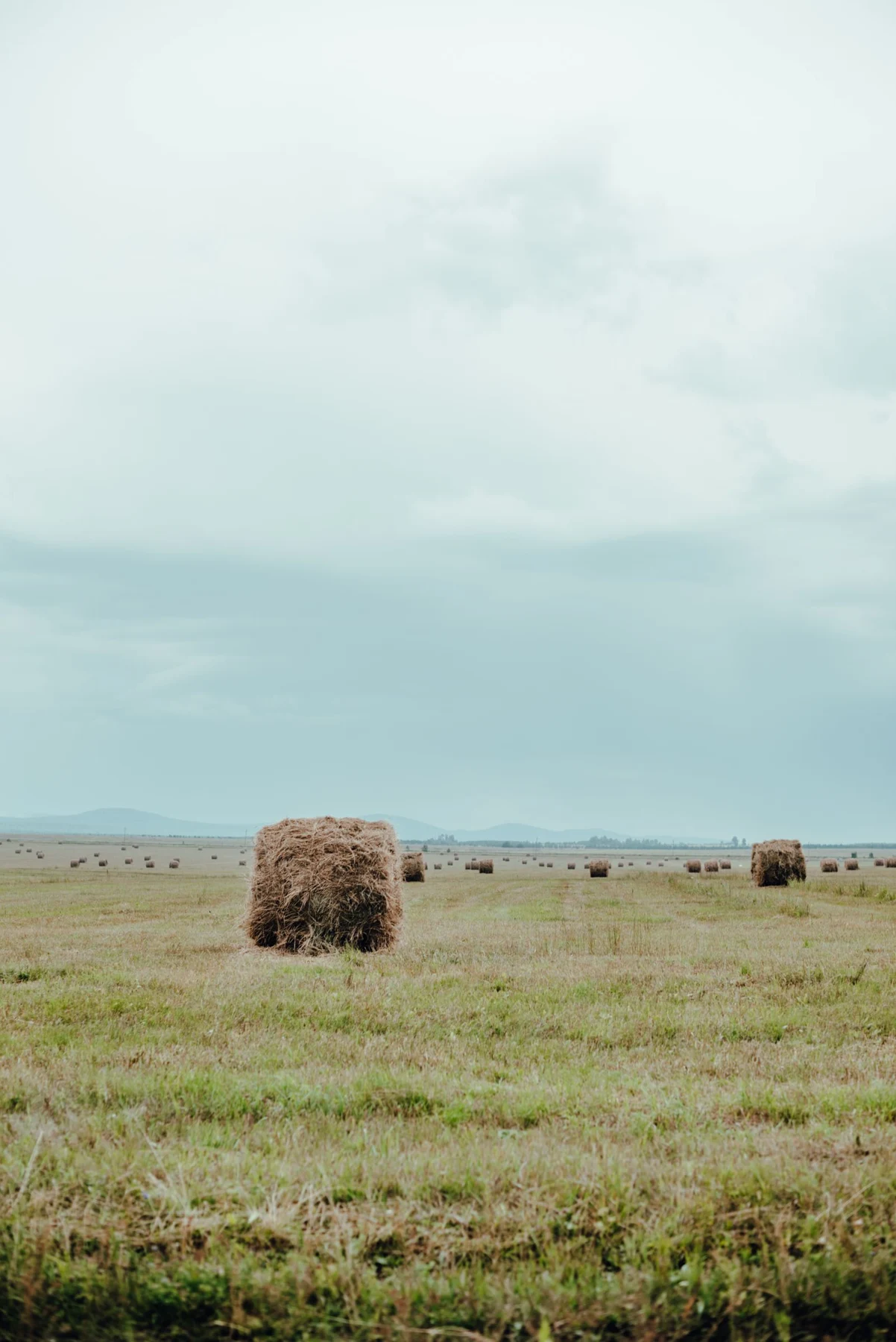
A busy photograph can make a spare illustration seem almost blank. That can be a useful contrast, but the illustration may need more physical size or a stronger line to hold its place. Compare the group from a distance and see whether both works remain present.
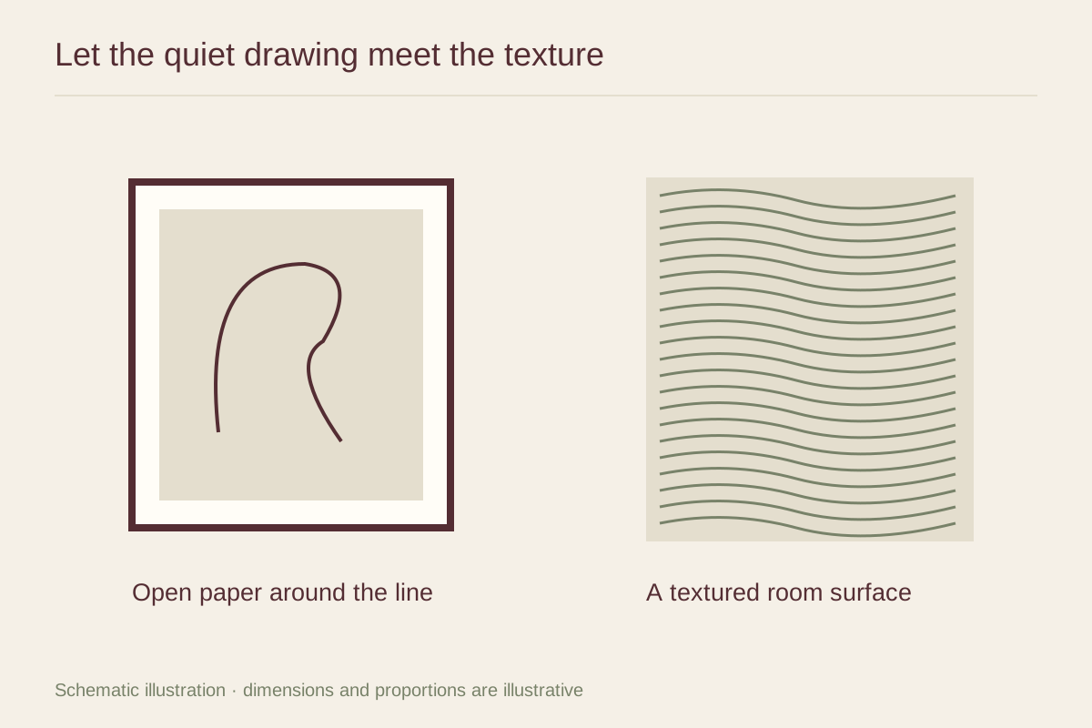
Open paper in the illustration can act as a pause beside the photograph's texture. Preserve it when it is part of the composition. Cropping every image to fill equal rectangles may remove the very difference that makes the mixed display interesting.
Give the frames a shared role
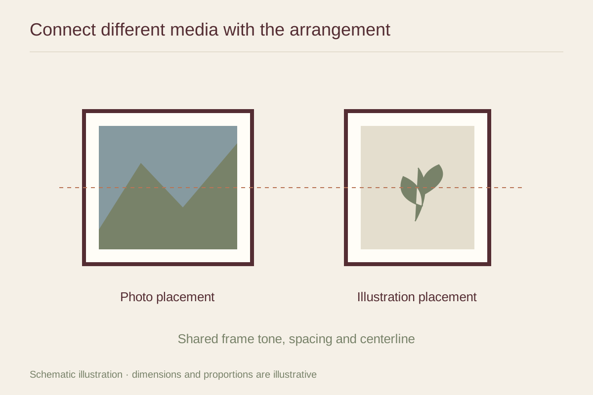
Related frame colors can provide enough cohesion for different media. You might use the same simple molding with different mat widths, or two wood tones within a restrained range. Check the paper whites side by side; photographs and illustrations may have noticeably different base tones.
A physical print sample is helpful when one image is glossy and the other matte. The glazing may unify some aspects of their appearance while reflections still affect them differently. Judge the finished presentation under the light where it will hang.
Test the sequence
Place the strongest image first in your mockup, then add the quieter one. If the group grows, alternate dense and open compositions rather than dividing all photographs onto one side and all illustrations onto the other by default.
Leave consistent enough spacing that the frames read as a group, but allow for different outer sizes. A small asymmetry can feel intentional when the visual weights balance. Take a photograph of the arrangement and check it in grayscale as an additional way to notice whether one dark image dominates all the others.