Choose the mood of the objects
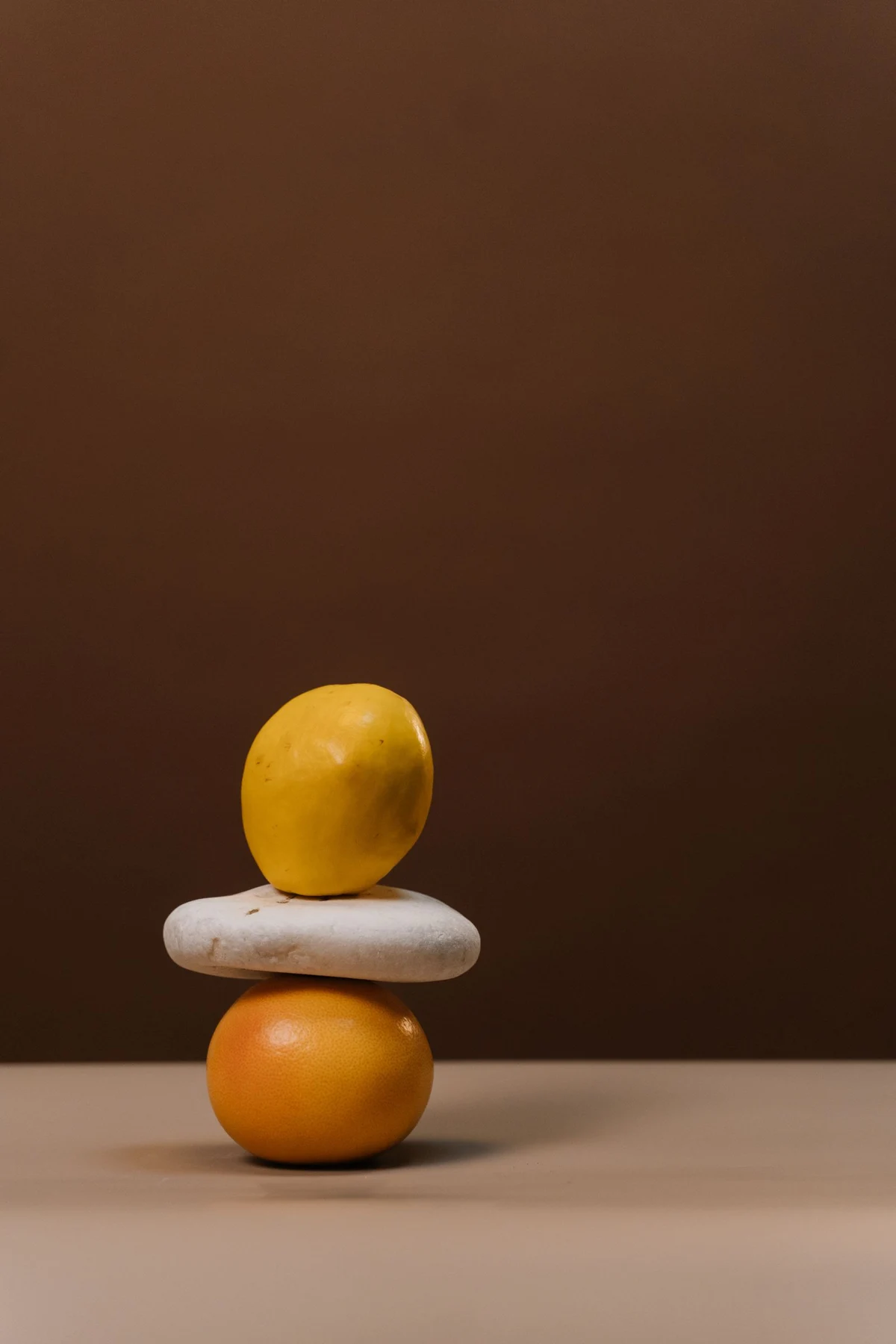
A tightly arranged still life with hard light may feel graphic and deliberate. A loose painted table scene can feel more informal. Consider the furniture and the pace of the room: a simple breakfast corner may welcome a playful image, while a dining area shared with a living room may benefit from a quieter composition.
Look at the background as well as the objects. A dark field behind pale pears gives a very different weight from a white bowl on a cream tablecloth. The background usually occupies enough area to influence the wall even when the subject is small.
Use color without matching the tableware
One repeated color can connect the image to the room. A muted green in a pear might relate to a chair seat, or a rust-colored vessel could echo wood. There is no need to buy dishes that duplicate the print or to choose a food subject that matches the kitchen's accent color exactly.
If the room already has patterned tile, compare a still life with broad shapes and fewer small details. If the surfaces are mostly plain, a more intricate arrangement can add interest. Test the print beside the tile and cabinet finish rather than viewing it in isolation.
Keep the location out of the working zone
Choose a dining-side wall away from cooking splashes, steam, and direct heat. A frame does not make paper artwork appropriate for every kitchen location. If the only available wall receives frequent moisture or grease, reconsider the placement before choosing a more expensive frame.
Check the view while seated at the table. A picture hung for standing eye level alone may feel remote during meals. Use a template to find a position that relates comfortably to the table without being vulnerable to chair backs or passing trays. The image should contribute to the dining experience while remaining outside the room's busiest practical activity.