Distinguish appearance from process
In woodblock printing, an image is transferred from an inked relief surface to paper. A digital reproduction can preserve the look of a woodblock image without being printed from a block itself. Read the product description carefully if the making process matters to you; a textured-looking photograph is not enough to establish it.
The Metropolitan Museum's account of Japanese woodblock printing explains how separate blocks can contribute different colors. You do not need a technical history lesson on the wall to appreciate the result, but understanding the process can make the deliberate boundaries and layered shapes more interesting to look at.
Choose a restrained color relationship
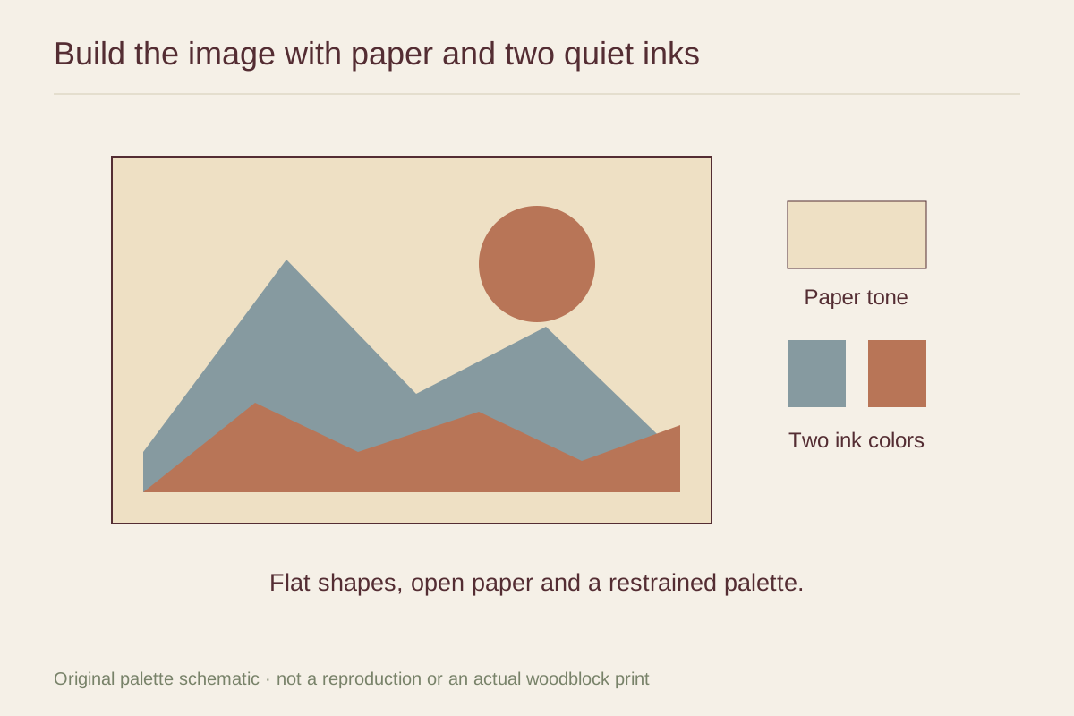
A print with indigo, muted green, and cream can sit within a quiet palette while still offering strong contrast. Look at the darkest outline as well as the overall colors. That outline may connect more clearly with a chair frame or lamp than any of the softer areas.
Avoid assuming that quiet means pale. A deep blue print can feel composed when its shapes are broad and the surrounding room is uncluttered. A pale print filled with many small marks can be more visually active. Compare composition and contrast together.
Respect the paper and border
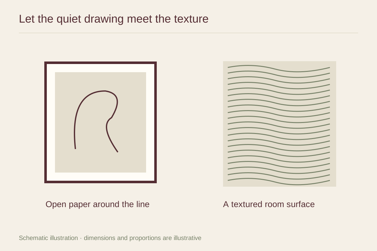
A visible paper margin can help the printed shapes breathe. If there are inscriptions or a seal, decide whether they should remain in view and have the mat opening planned accordingly. Do not trim an original or uncertain print to fit a convenient frame.
A restrained wood or dark frame can provide a clear boundary without imitating a particular cultural style. Let the image's own composition carry its identity. For an older or delicate work, consult an appropriate framer or conservator about the materials and display conditions before treating it like a replaceable decorative poster.