Choose one celestial language
A labeled lunar chart invites close reading. A minimal moon disk acts as a graphic shape. A richly colored nebula photograph brings texture and saturated color. Those are distinct visual languages, so begin with the one that suits the wall rather than collecting all three simply because they share a subject.
If the image includes scientific labels, confirm that the text remains readable at the selected size. If the labels are not the point, a less densely annotated image may be more satisfying than a chart reduced until it becomes a pattern. A dark background also deserves a reflection check from the room's normal viewing positions.
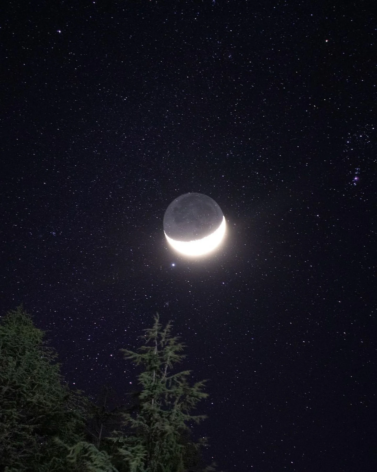
Use the palette to relate the print to the room. A charcoal moon image can connect with a dark lamp or chair frame, while a blue-black field may introduce a cooler note among warm woods. You do not need metallic stars elsewhere to explain the connection.
Keep the surrounding arrangement grounded
Choose furniture and lighting for their normal functions. A celestial print above a plain cabinet can be sufficient on its own. If you want a companion piece, consider an abstract image with related shapes or a quiet landscape rather than another literal planet.
A simple frame lets the round forms inside the picture remain clear. A wide pale mat can separate a dark print from a dark wall; a narrow dark frame can make it feel more continuous. Compare both using the actual image, since the amount of black or blue around the subject changes the effect.
Leave some visual space between the artwork and collections of small objects. The contrast between a large distant subject and ordinary objects nearby can be part of the pleasure. By limiting repetition, you allow the celestial image to suggest scale and curiosity while the room remains flexible for everyday life.