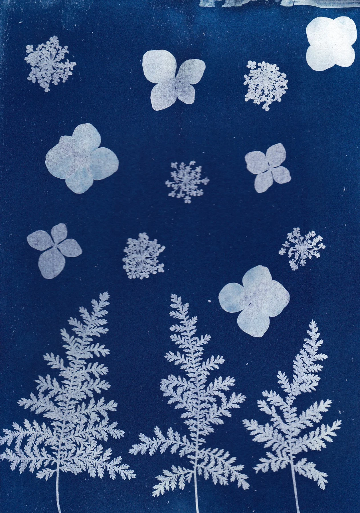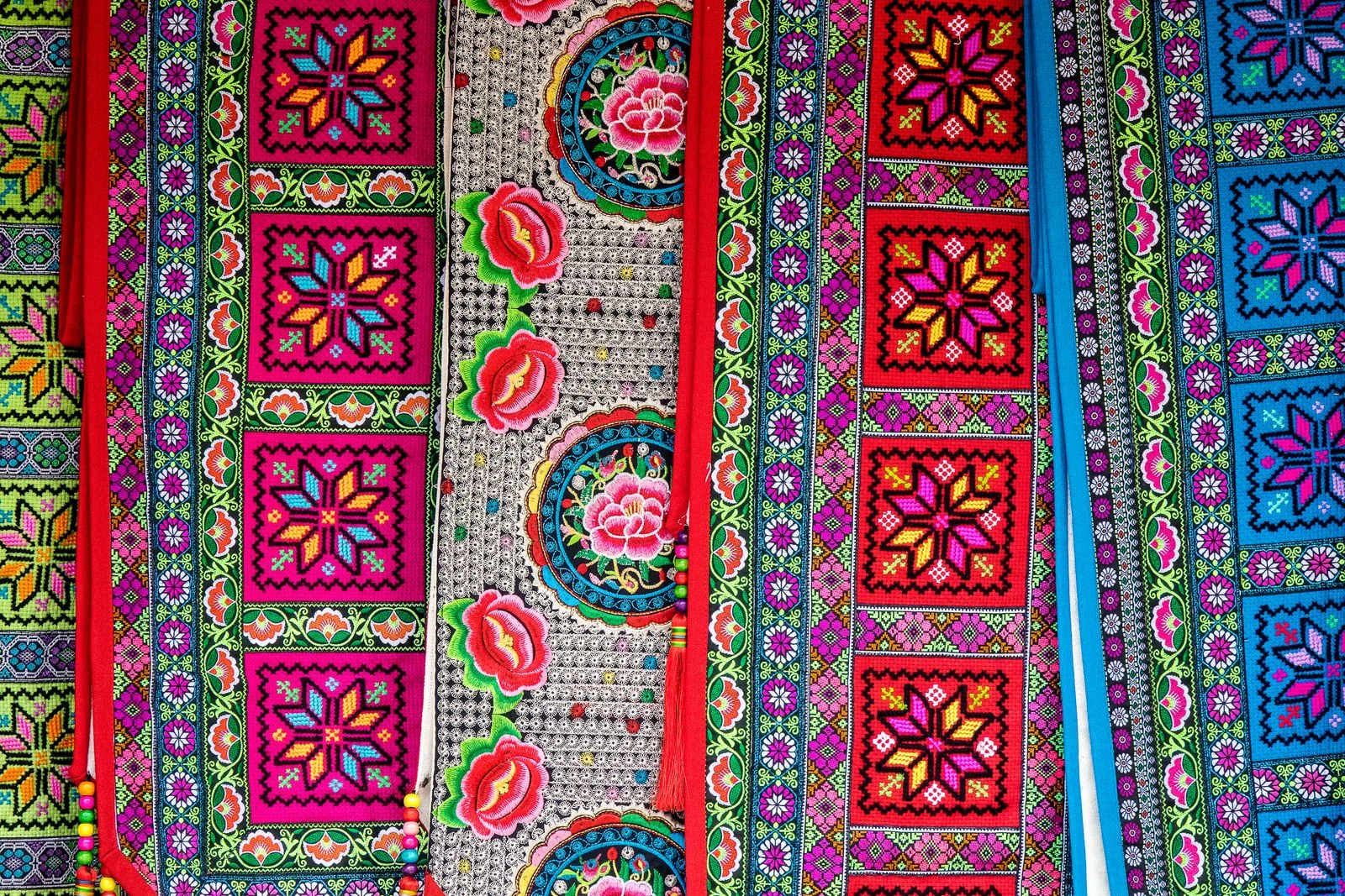
Look for the pattern's main rhythm
Some images repeat small motifs evenly; others organize them around a central figure or border. Identify that structure before choosing the print size. A fine pattern reduced too far can become visual noise, while a large central motif may remain clear across the room.
Read the available description of the work and its creator. If a symbol or scene has a specific meaning, that context may influence how you want to display it. Avoid assuming that every motif is simply an abstract ornament because its meaning is unfamiliar.
Let fabric provide a broad color field
Plain curtains, a solid sofa, or an unpatterned bedspread can relate to one color in the print without duplicating its motifs. A subdued version of a dominant color often makes a more flexible connection than an exact bright match. The textile then provides a setting while the artwork carries the detail.
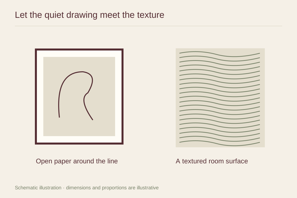
Compare the scale of the room's other patterns. A wood grain, tiled floor, or woven rug may already contribute repetition even if the fabric itself is plain. Step back and assess all those surfaces together before adding another patterned accessory near the print.
Frame the whole design
Borders can be integral to a patterned image, so check that the mat or frame does not clip them unevenly. A simple profile may preserve the work's rhythm more clearly than a carved molding with a second pattern. A colored frame can work, but it should serve a specific relationship in the image.
One substantial print may be enough above a plain textile surface. If you add a companion, choose it for an actual visual or contextual connection rather than a broad label. Keeping the selection specific makes the display more interesting and avoids reducing different traditions to a single decorative category.